
This post is my submission for the picture symbol icon module’s connectivity theme based around a hypothetical social media site ‘Letters Home’, it includes;
– Looping animated gif
– Logotype design for ‘Letters Home’ a hypothetical social media site
– 4 Icon Design helping users navigate Animation Challenges, Type Glossary, Members & Galleries for ‘Letters Home’
Looping Animated gif
The gif we were asked to create would be used as part of this hypothetical social media site, Letters Home. The animation had to be of a chosen letter and was to be a minimum of 2 seconds long. I chose to create a stop motion gif, using 13 separate images to show the letter O.
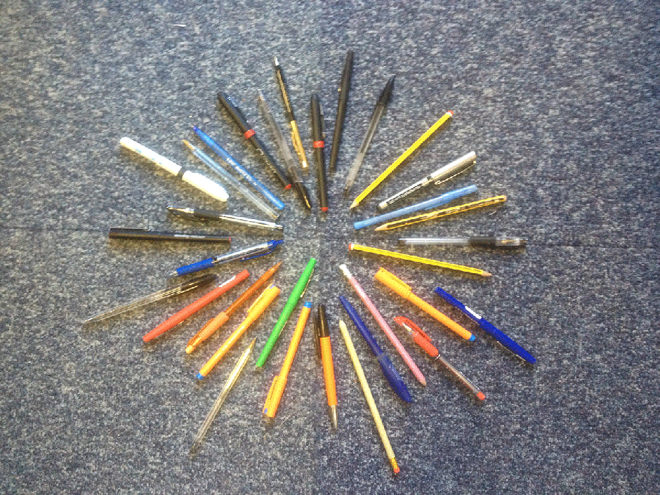
In hindsight I would have made a much better gif had I used a tripod and better camera but this was the best I could do with my smartphone and a pot full of pens.
Everyone else’s gifs seemed to be animated on Photoshop and were all very similar, much like my practice letter T gif at the top of the page. I wanted to try doing something using real photos and stop animation. I’m happy that I produced the finished gif but realise I could have made it a lot better had I not been limited to by equipment.
Logotype Design
The next part of my submission is the logotype design I came up with for Letters Home. Its designed to be part of the dashboard interface for Letters Home with the 4 icon designs.
I didn’t produce these in a digital format, I felt that drawing them showed how I wanted the dashboard for Letters Home to be presented, I wanted it to have a minimal amount of features, the type logo and the 4 icons.
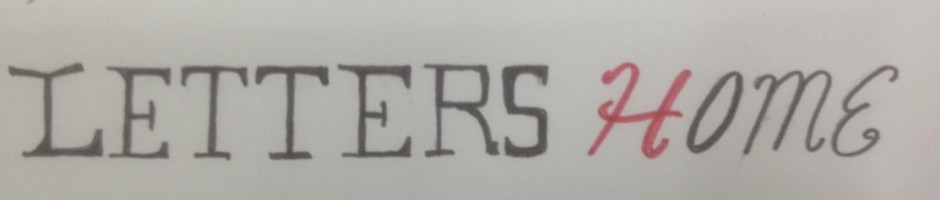
I wanted the text for ‘Letter’ to resemble the font of a typewriter, with the text for ‘Home’ to feel more welcoming/less harsh hence the more hand written styled font for ‘Home’.
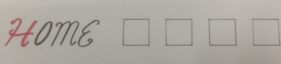
I also envisioned the icons being lined up next to the Letters Home typed logo, the icons would be separated and equally spaced out in 4 boxes that when clicked on would take the user to each of the 4 areas, animation challenges, type glossary, members & galleries.
Icon Design
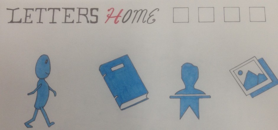 Above at the top you can see the site’s type logo with the 4 areas for the 4 different icons to be located. Below are the 4 finished icons I designed. The blue man would represent animation challenges which users could follow to access the challenges set for them.
The book icon would take users to the type glossary page.
The members icon is the blue bust of the head and shoulders with a banner beneath. Finally the icon showing the rudimentary picture of some mountains would represent the galleries page and when clicked on would take the user to the galleries page.


