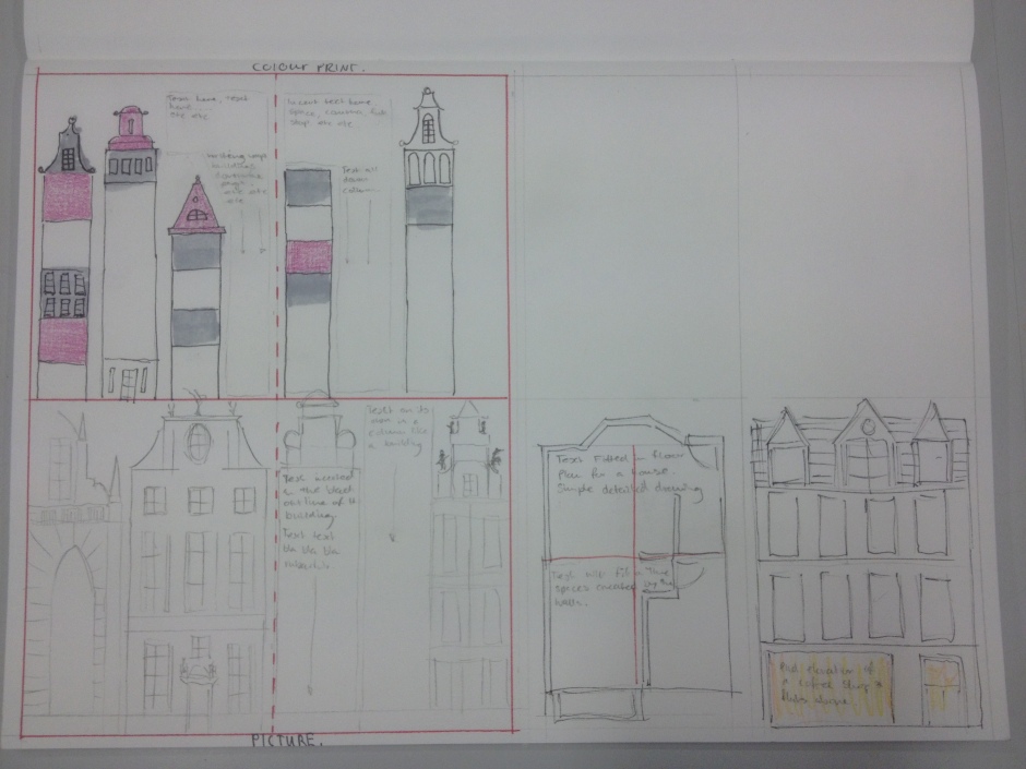
One of our deliverables for this theme in the picture symbol icon class is a two page magazine spread, 2 A4 pages including a contextual image and the text content.
Before we began we had to conduct some research and generate ideas form any inspiration we found. I began by looking at what I likes about the magazines I read such as the New Scientist or Architecture Magazine, for me like many others its the imagery that grabs my attention leading me to read the article. Below you can see some such examples.
New Scientist Examples
Architect Examples
I found other magazine spreads I liked while researching, work in particular by Deanne Cheuk for the MU Magazine (Musician’s Union) and Melanie Benton. I really likes Cheuk’s use of contextual images, something I need to do in my magazine spread. Examples below.
MU Magazine – Deanne Cheuk
The first example there is based on the Rorschach test, visually grabbing and I like the way its framed but the ample white space acting like a boarder. The second image is an example of good use of faded text or imagery layers behind the article, might be something I use ion my article. The third example I liked because of the simple playful way the text mirrors the image on the opposite page, simple symmetry.
For me the hardest part is envisioning how my contextual image (don’t know what it will be yet, whole other issue) will tie in with the article, specifically how to layout the text and image to create a good two page magazine spread.
After speaking to Ewan Steel our lecturer for this module I came away with the advice of looking at examples of articles that could be adapted to encompass my two or three ideas for a layout and contextual image. I liked in particular an article spread by Melanie Benton – see below, I could really see how I would like to style my text to mimic a skyline similar to Miss Benton’s article.

Below are a few ideas I have been sketching for possible layouts of my two page article spread. I played with the idea of having a coloured print where my text would fill in the gaps between some of the buildings (top left). My second idea was to have a colour picture of some town houses and have my text imposed above one or two of the buildings (bottom left). Thirdly was an idea to have a picture of a floor plan with the words filling in the different rooms depicted, while on the other page either an photo with the aid of photoshop or a drawing showing a block of empty flats above a busy cafe, possibly some statistics on the size of average UK homes and how the amount of time we spend in our homes and the amount of guests we entertain has decreased.


